Slicers in Power BI reports: Making your Power BI reports more powerful with slicers
Here at Gravity Union we recently finished developing a suite of Power BI reports that help you understand your Collabware configuration, environment health, and usage. With over two dozen reports, we surface a wide variety of scenarios and information to keep you up to date.
While in the development process, we encountered many of the typical challenges one finds in data projects, but the one I’ll talk about today is maintaining a consistent presentation across dozens of reports.
Slicers are often featured in Power BI reports as they provide a dynamic element which end users can take advantage of to really explore their data. They can appear as check box lists, sliders, drop downs, buttons or even custom images. They can be displayed vertically or horizontally. And of course, the number of selections available in a slicer may be small, like ‘Yes’ or ‘No’, or they may be large, such as a list of Sites within your SharePoint environment. Different reports will need different kinds, and quantities, of slicers. So how do we reconcile this need with our goal of providing a consistent look and feel?
I’ll walk you through one convenient option below…
Collapsible Slicer Panel
We’ll begin with our report. Looks nice, but it doesn’t have the added interaction we’re looking for.
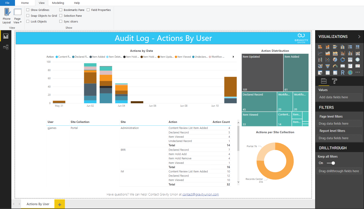
Our Starting Point
1. Add the slicers
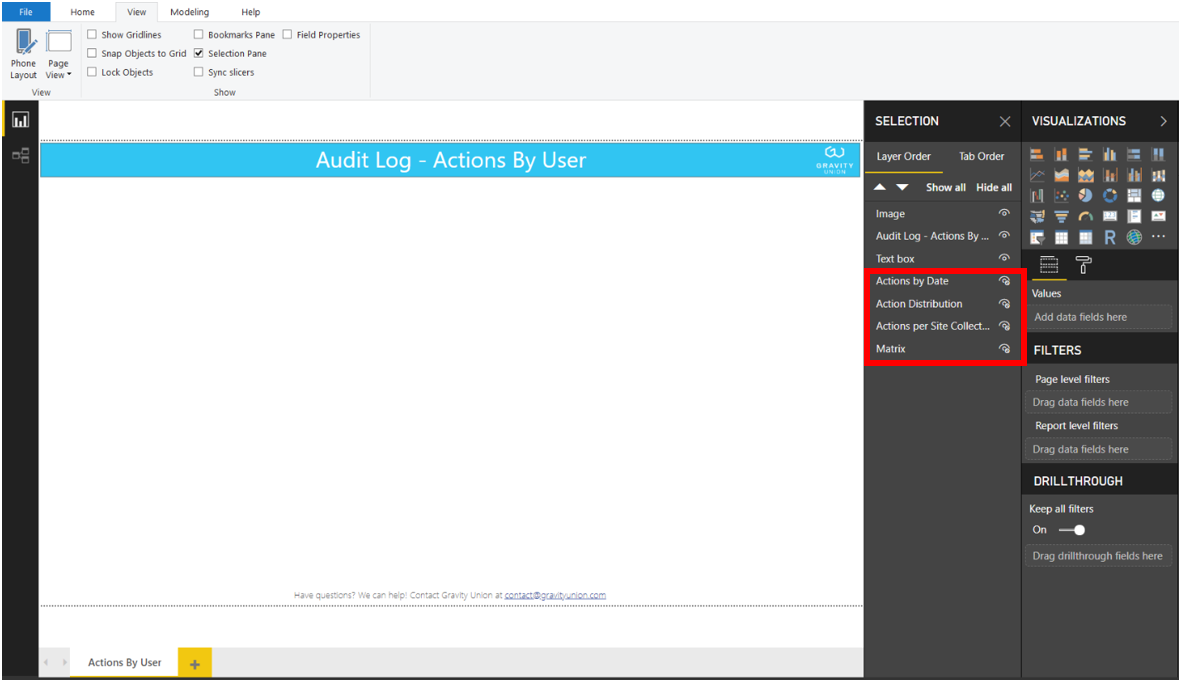
The first thing we need to do is make a space to work with. You could shrink your existing charts or tables for the time being, or simply make them invisible for now through the Selection Window:
Adding slicers like a pro
Next, we’ll add the Slicers. We want to focus on user Actions and time frame, so I’ll include Slicers relating to each of those elements:

You’ll want to set the Selection Controls as appropriate for each particular Slicer, and update the formatting to suit your organization’s needs. In our example, we’ll enable the ‘Select All’ option, and remove the restraint for ‘Single Selection’ so our users will be able to choose any combinations they would like:

Adding selection controls like a boss
Another optional step I like is to use the Title instead of the Slicer Header. The end user gets the same experience, but each Slicer now has a distinct name in the Selection Pane which makes my life a little easier going forward:

Clearly naming slicers
2. Add the Pane
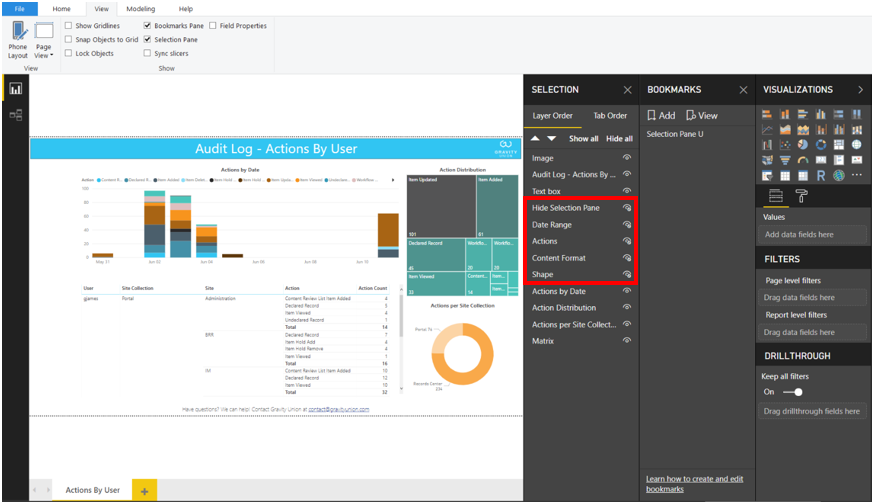
Now we’ll add the Collapsible Pane which will house our slicers. This is just a rectangle supplied by the Shape menu. We’ll size it slightly wider than is needed to house all our Slicers, then take care of the other formatting, such as adding a border:

No pane no gain

Formatting the pane
At this point you may have a Pane that is actually hiding your Slicers, rather than appearing to contain them. This can be corrected by adjusting the order of your objects in the Selection Pane, where items at the top are ‘In Front’ of items below. Simply drag the ‘Shape’ corresponding to your Pane below all of your Slicer objects.

Sorting objects
While we’re at it, let’s unhide our original charts, and ensure they are below the ‘Shape’ object in our Selection window.

Using a background colour with a slight transparency will show your users that the report they expect still exists, unchanged, underneath the Pane.

Shading the pane
3. Add the Close Button
Great! We have a beautiful container for our Slicers. Now we need to provide a way to close the Pane. We’ll insert a built in Left Arrow button and place it at the far edge of our open Pane. In the final step we’ll attach an Action to this button, but we’re not quite ready for that yet.

4. Add the Open Bookmark
What we should have now is the view we expect to see when our Slicer Pane is open, so let’s open the Bookmark window and Add a ‘Selection Pane’ bookmark:

Adding an open bookmark
By default, anytime the Bookmark is called, it will bring us back to the Display, Page, Visuals and selected Data that existed when we created it. This means our Slicer settings will be recreated, which isn’t something we want in this case. To disable the Data refresh, go to the ellipses to the right of the Bookmark name, and unselect the ‘Data’ option:

5. Set the Visibility
The next step will be creating the view we expect when the Slicer Pane is closed. We can accomplish this with the Selection window by hiding our three Slicers, our ‘Hide Selection Pane’ button, and our ‘Pane’ shape:
Setting visibility
6. Add the Open Button
We’re back to our original report, but our users will need a way to open the Slicer Pane. You could use the built-in Right Arrow button, or insert your favourite menu icon:


7. Add the Closed Bookmark
Perfect! So back to our Bookmark window, we Add the ‘No Selection Pane’ bookmark, and unselect the ‘Data’ refresh:

8. Add the Actions
The last thing we need to do is tie the Bookmarks to their respective buttons through the ‘Action’ configuration. The Type will be Bookmark, and for our Open button, the Bookmark we choose will be ‘Selection Pane’:

To test this out in Power BI Desktop, hold the CTRL key and click the Open button. You should now see your Slicer Pane:

Testing
Let go of the CTRL key and highlight the Close button, then repeat the Action process, but choose the ‘No Selection Pane’ bookmark:

More testing
To test, once again hold the CTRL key and click the Close button. Now we should see our report, free of the Slicer Pane:

It’s as “simple” as that!
While our example did not use very many Slicers, and was not very wide, you could certainly go right across the page with it, in essence doubling your working space without taking away valuable screen space for your charts and data.
Reach out to us if you want to learn more about using Power BI in your organization.