Tips for building better Power BI dashboards for Google Analytics data
Marketing teams often need to bring together data from different sources to share insights from web and social usage. For example, Google Analytics has data on website engagement and Mailchimp has data about email subscribers.
Recently we tackled this for our use at Gravity Union and for a client. Here’s a peek at some of the dashboards we created in Power BI and our tips for setting it up so it’s intuitive for your users:
Tip 1: Start with a summary dashboard
Create a main dashboard to highlight the top metrics that you care about. For example, on this dashboard for Gravity Union we care about: sessions today, sessions this week, bounce rate, where people are coming from.

Power BI dashboard example of key Google Analytics data
Tip 2: Add pages for detailed metrics
You will have more data than you can easily display for users.
To address this, use different pages to show detailed metrics. For example, we put devices and access on a sub-page:

Detailed page showing device and channel Google Analytics data
Tip 3: Plan views for the most useful timeframe
It’s important to plan what time frame you want to use to display your data in Power BI. Do you want to see data by day, week, or month?
Behind-the-scenes you need to choose the time frame from Google to match what you want to display. Google delivers User counts as unique users per time frame. If you want your Power BI report to match your Google Analytics dashboard, you need to choose the same time frame on both.
For example, if your dashboard shows daily user counts, you select a daily granularity for your Date dimension when requesting the data. If you had a user that visited once each hour, a Daily granularity counts them as a single user, but an hourly granularity counts them as 24 users.
Tip 4: Configure time formats where needed
Session durations and other time fields are conveniently shown as hours:minutes:seconds when viewed as Power Query output, but may change to a confusing decimal number when shown on the report. The decimal is a percentage of a day. Simply multiply it by 60*60*24 to get the number of seconds as shown here:
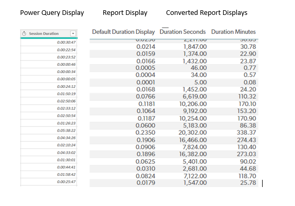
Power Query vs. what you get in the Report. Use a multiplier to convert decimals into seconds/minutes.
Tip 5: Add data from supporting systems
So far, we’ve focused on Google Analytics because it’s the main source of data for many marketing groups. However, there are often supporting systems of data for email, social media and other channels.
For example, at Gravity Union, we use Mailchimp to manage our email lists and subscribers.
The power of Power BI is the ability to bring in information from different systems like this. In our Power BI dashboard, we add a page for the team to dive into the most recent email stats without having to login to Mailchimp. It shows current subscribers, subscriber changes in the past week, and the funnel for the most recent campaign:

Mailchimp data in Power BI
Tip 6: Promote the dashboards in Teams and SharePoint
The final tip is to share the dashboards in places where people can find them. We add this as a tab in Microsoft Teams within the Marketing team, and it’s part of the Marketing SharePoint site.

Power BI dashboard as a tab in Teams
Summary of the benefits of using Power BI for marketing data
In summary, a few benefits of showing your digital marketing analytics in Power BI are:
Saves time: You no longer have to copy visuals and data into your preferred formats, and instead simply refresh a page. In addition, common requests can be addressed, and available on demand (at the client we worked with, this means the Marketing and IT teams can focus on other projects, as the other departments interested in the website can answer some of their own questions).
Reach a wider audience: interested stakeholders won’t need access to Google Analytics
Visuals vs. numbers: Visuals can make trends or anomalies easier to identify (for example, that post/email in August really captured readers!)
Data reuse: Having a well-constructed dataset available in the background through Power BI allows other groups to incorporate helpful aspects in their own reports.
Future opportunities: All the above creates more opportunity for discussion and they can come up with useful visuals you didn’t think of.
We hope this inspires you to bring in data into Power BI for use by your teams! Reach out if you have questions or want advice on setting it up.