Building Delightful SharePoint Pages: Modern Design Enhancements in 2025 (Part 2)
Here's something I hear all the time when I'm helping teams build employee portals:
"Can we make SharePoint look less... SharePoint-y?"
I get it. SharePoint has always had a distinctive look—and not always in a good way. The good news? We've come a long way since those rigid, boxy pages from SharePoint 2010 and 2013. These days, SharePoint Online pages look more modern.
In our first “Delightful SharePoint Pages” post (last updated in 2024) we shared six tips for creating appealing pages. We covered foundational advice for making pages consistent and looking good such as using images strategically, setting up multi-column layouts, and getting creative with Quick Links and section designs. All that stuff still works great.
But Microsoft has been busy rolling out some exciting new features in 2025: new web parts and styles, flexible page layouts, and new page templates for easily building engaging pages.
Microsoft’s preview of the expanded templates gallery looks amazing—it really shows where SharePoint pages are heading. Unfortunately, they had to pull it back temporarily (more on that below), but it gave us a taste of what's coming.
In this post, I want to walk you through these latest features and share recommended practices for creating SharePoint pages that break out of the SharePoint mold—pages that feel less "SharePoint" and more polished.
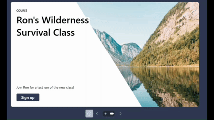
Hero Web Part Enhancement: A Carousel
SharePoint pages are still built from web parts, but recent updates have given us some exciting new styles for key web parts that really amp up the visual impact.
The Hero web part now supports a carousel layout, which means you can create dynamic, slideshow-style content instead of only the standard static tile grid. It auto-advances through slides, letting you highlight multiple pieces of content in the same space.
Animated GIF with Hero Carousel slides in action
Each slide can include a compelling image, bold header text, description, and a clear call-to-action button which you edit, reorder, and add links to in the web part properties:

Hero webpart properties
Here's what works well with Hero carousels:
Use high-quality, well-cropped images for each slide
Write concise, punchy headlines that grab attention
Take advantage of the built-in text styles and overlays to keep things readable—try the dark/light overlay, text box, or diagonal split layout
Resist the urge to cram in too many slides or too much text
That last point is critical: It's tempting to feature everything in a carousel, but when you overload it, people tend to just scroll past. Keep the content fresh and focused.
These styling options help your message pop while maintaining contrast and accessibility. Notably, the new Hero was designed with accessibility in mind so you can add alt-text for screen readers on each slide (or mark a slide as decorative), ensuring no one misses out on the information.
Editorial Card Webpart
The Editorial Card web part might be my new go-to for adding visual impact to pages.
It’s a great way to create a polished promo or announcement. Think executive blog posts, upcoming events or new programs in your organization. It includes layout and style options to fine-tune the appearance: content alignment, text overlay opacity, call to action buttons, icons and more.

Example of the SharePoint Editorial Card webpart styles
Using the Editorial Card effectively is straightforward.
Choose a high-impact image (one that isn’t too busy behind text)
Keep the title snappy
Ensure the call-to-action is clear (“Read more”, “Register now”, etc.)
Adjust visual settings such as how dark or light the overlay is
Many organizations are adopting this web part because it’s so easy to get great results. Maybe it’s too easy, in fact! 😊
To keep things from looking repetitive, use editorial cards sparingly—save them for your most important highlights so they keep their punch. For secondary content, stick with simpler text or image web parts. When used thoughtfully, editorial cards give your page that polished, magazine-like look that engages people.
Internal communicators especially love how they create focused messages without needing custom graphics. Make sure to align the style with your site's overall branding by using your brand colors and imagery so these elements feel like a natural part of the page, not something slapped on top.
Flexible Sections
Flexible Sections can really take your pages out of the “SharePoint Look.”
Flexible Sections move SharePoint page design beyond the old rigid column system. In the past, pages were confined to predefined layouts (one-column, two-column, etc.), and web parts snapped into a fixed grid.
Flexible sections break those constraints, giving page editors more freedom to resize and reposition web parts. This turns a SharePoint page almost into a free-form design canvas similar to a PowerPoint slide, but with web part functionality intact.

A SharePoint flexible section with overlapping images and webparts.
What can you do with flexible sections?
Drag and drop web parts arbitrarily instead of sticking to locked zones
Resize web parts both vertically and horizontally, instead of every part just filling the column width
Stretch an image full width or reduce it to the corner
Overlap web parts to create a layered look such as an image behind Quick Links
In classic SharePoint, doing that was impossible without custom code; now it’s a native capability. Crucially, all this is implemented in a way that maintains responsive design: even if you move things around freely, SharePoint ensures the page still reflows appropriately on different screen sizes (desktop, tablet, mobile).
Tips for Working with Flexible Sections
With great power comes some complexity: It’s wise to plan your layout before you start dragging things around. Consider sketching a wireframe or layout idea on paper or a whiteboard first. This helps you determine which elements you want to emphasize and how they might overlap.
-
Use layers judiciously! You still want the content to be readable and not too cluttered. Similar to the Hero webpart, ensure that text placed on images has sufficient contrast.
-
SharePoint offers a mobile preview option in the page editor. A layout that looks amazing on a widescreen monitor might need adjustments to work on a phone. For example, complex multi-column layouts could stack poorly on mobile, so verify that the content order and emphasis still make sense.
-
Flexible sections let you break out of the grid, but you should still use your corporate colors, fonts, and imagery guidelines to keep the page on-brand. The Brand Center in SharePoint can help with this, by allowing certain branding elements like standard fonts to apply site-wide for consistency. In part one * we recommended using an Organizational Assets library for images, which remains important. Even if you place images freely, you want to use approved, high-quality images and logos to maintain a professional look.
-
The flexible layout feature is meant to unlock creativity. Microsoft encourages site owners to “play with the tools” and iterate, since the features are designed to be intuitive. You can always undo changes, revert versions, or move web parts back into a structured section if needed. I often duplicate a section to try something out and then delete the one that I don’t need later.
Over time, you might even develop your own flexible section templates that you can reuse – for example, a stylized banner + text combo that you use on every campaign page, saved as a template for quick addition. Embracing flexible layouts can make your SharePoint pages feel truly modern and bespoke, rather than generic intranet pages.
The New Page Template Gallery (sort of)
Creating a well-structured page from a blank canvas used to be daunting, but the new SharePoint template gallery is attempting simplify this by providing more ready-made page designs.

Preview of the new SharePoint Page Template gallery. Source: Microsoft
In mid-2025, Microsoft introduced over 50 new modern page templates that authors can choose from when creating a page. These templates serve as inspiration and jump-starts, offering layouts for common scenarios like options for topic pages, news articles, department pages, FAQs, and video highlights. These templates showcase “the art of the possible”—for instance, a template might demonstrate a well-balanced mix of text, images, and sections, giving content creators a vision of a polished outcome.
We like it because authors don’t have to start from scratch, thus avoiding the “blank page” syndrome. If you need a standard topic page, you might grab a template that already has a section for a large banner image, a section for key points in a three-column layout, and an FAQ section at the bottom. All you do is fill in your content and images. This not only saves time but also ensures a level of consistency in design.
Consistency is valuable for user experience because readers learn where to find certain types of information if pages follow known patterns. Templates (especially ones tailored to your organization) help achieve that consistency across the intranet.
“So, where is this template gallery?”
As of this writing, the template gallery may or may not be in your tenant. It was seemingly rolled back by Microsoft, but they haven’t officially messaged this.
Why? At launch, there was vocal feedback about the lack of control to tailor the list of page templates for authors, templates not matching corporate brand guidelines and other glitches.
We are hopeful that Microsoft will roll this out again, along with future tenant-wide custom templates to improve consistency across the board.
Recommendations for Template Usage
If the out-of-the-box templates meet your needs, take advantage of them. They’re great for learning what a well-designed page can look like. Pay attention to how they use images, spacing, and web parts.
However, if you have strict branding, plan to customize or create templates. You might develop a set of company-specific page templates (e.g. an HR policy page template, an internal news story template, a team project page template) so that your authors have a consistent starting point that aligns with your look and feel.
Note: PowerShell is required today to deploy page templates across an entire SharePoint Hub or tenant. Reach out if you want help with that or if planning a set of templates makes sense for your employee portal!
Summary
The modern SharePoint page is a powerful canvas for communication. Part 1 of our blog series emphasized core principles to make pages delightful; now, with Part 2, we’ve seen how new features like the Hero carousel, Editorial cards, flexible layouts, and the template gallery can further elevate what we can do.
By combining engaging web part styles, smart layouts, templates, and thoughtful content strategy, you can create intranet pages that not only inform but delight.
Happy page building!