SharePoint page templates: Highlights from the updated gallery
Microsoft’s release of 30+ new SharePoint page templates in 2025 is a big leap forward in making intranet and portal design more modern, flexible, and visually engaging. These templates showcase creative use of Flexible Sections, section backgrounds, and layout techniques that make SharePoint feel less “SharePoint-y”, and more like a polished web experience.
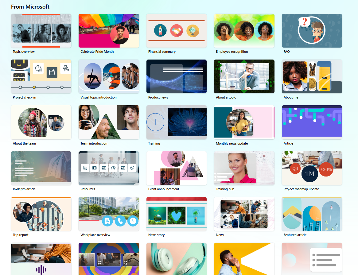
SharePoint’s updated template gallery
There are so many, in different visual styles, that it can be overwhelming!
To help, here are five highlights from the new bundle—it was hard to choose only five!—and more importantly, what each one teaches us about better page design.
1. Landing page or Resources Template
Why use it: Sets the stage for a topic, role or department.
What you can learn:
See how Quick Links, Editorial and Hero webparts work together to provide an overview of a topic tailored to a role.
Examples of customized section backgrounds with related images.
To make it fit your organization make sure to use your brand images.
Landing page template with content resources in editorial, hero and quick link webparts.
2. FAQ Template
Why use it: Organizes dense page of information or FAQs into self-service content.
What you can learn:
Example of using in page links for navigating long pages.
Organize content for quick scanning with enough white space.
Customize with brand-aligned backgrounds and colours to maintain consistency.
FAQ template using in page links and sections
3. Long form Article
Why use it: Structure a long page or news article with links to more sites and resources.
What you can learn:
Another way to use in-page links
Use of background images that are similar in style and theme
Different columns in Flexible Layouts (some are three-column, some four-column)
Use of editorial cards to go to related pages / sites
Long-form article featuring more content and links
4. Roadmap Update or Infographic Template
Why use it: Visualize progress on a project or share future plans.
What you can learn:
Uses text sizes, styles and carefully placed webparts in Flexible sections to share progress and status.
To customize align visuals with your brand palette using custom backgrounds or theme colours.
Roadmap template with flexible sections for infographic-style page
This is an example of a flexible section in more detail with the “infographics.” Note that it is using different sized text, divider lines and images for arrows that are precisely placed:

Flexible layout in more detail
5. Team or Department introduction
Why use it: Introduce teams, projects, or new initiatives.
What you can learn:
Balance visuals with concise messaging for purpose, vision, mission.
Use section backgrounds in interesting shapes and sizes for a modular page. In this example, different section backgrounds are stacked to create a streamlined yet visually interesting look.
Template with interesting section background images
How did they create the interesting section borders (i.e. the waves?) With good use of section background images that stack like this:

Example of a section background image used as a border
Another way to separate sections in an interesting way is to use gradients, which fade from Bottom to Top and draw the eye down the page:
Each template has something to offer, so if you manage an employee portal or SharePoint environment, we highly recommend reviewing all of Microsoft’s samples for design inspiration.
As you can see though, they all use very different colours, image styles and theming. We recommend creating a starter pack of templates for your employee portal that follows your brand guidelines.
🚀 Take action: Make the templates work for your org
To make SharePoint page templates work for your organization, here are two steps to get started:
1. Provide a “starter kit” of branded templates
Provide a curated set of page templates (e.g., News, How‑to/Topic, Landing) to for authors that use your brand colours and styles—especially since Microsoft’s gallery can’t be disabled currently.
Create “golden” versions of your most-used layouts and save them in a staging site or the Brand site’s Templates folder. We recommend:
News article page
Topic, FAQ or “How Do I” page for detailed content
Landing page or Topic Introduction
Status or Infographic page
Image / video gallery page
They will show up at the top of the templates gallery when authors create a page:

Custom page templates are promoted to the top of the gallery
💡 Tip: Use PowerShell or a tool like Sharegate to deploy these templates across your tenant or hub sites so authors always start with the right foundation. To keep the templates in sync, make a plan to run the script or tools periodically.
2. Build Your Brand Asset Library
Use the Organization Assets Library (OAL) to store:
Branded background images (color blocks, photos, gradients, patterns)
Logos, icons, and reusable visuals
Pre-sized image files for consistent layout
This gives authors easy access to brand-aligned assets directly from the image picker with no design skills required.
Final Thoughts
These templates aren’t just shortcuts, they’re also design lessons. By exploring how Microsoft built them, and adapting them to your brand, you can empower your authors to create pages that are both beautiful and consistent.
Need Help Getting Started?
Whether you're looking to:
Set up PowerShell deployment for templates across your tenant
Design a branded theme and starter kit of templates for your authors
Build a scalable Organization Assets Library
Gravity Union can help. Reach out to our team for hands-on support, design guidance, or a quick consult to get your SharePoint environment working smarter—and better-looking.